Address: 19 Sycamore Road, Colchester, UK | Email: info@webjournal.co.uk

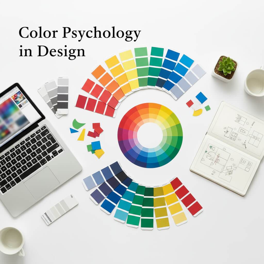
Color is much more than just a visual element—it communicates emotions, influences perceptions, and shapes decisions. In design, understanding color psychology is crucial for creating a brand identity that resonates with your audience and drives engagement. Choosing the right color palette can make your brand memorable, trustworthy, and appealing.
In this article, we’ll explore color psychology in design and provide actionable tips on how to choose the perfect palette for your brand.
1. What is Color Psychology?
Color psychology studies how colors affect human emotions, behaviors, and perceptions. Different colors can evoke specific feelings or associations, which can significantly influence how users interact with your brand.
Examples of Color Emotions:
- Red: Energy, excitement, urgency
- Blue: Trust, calmness, professionalism
- Green: Growth, health, sustainability
- Yellow: Optimism, creativity, warmth
- Purple: Luxury, creativity, sophistication
- Orange: Enthusiasm, friendliness, confidence
- Black: Elegance, authority, sophistication
- White: Simplicity, clarity, purity
By leveraging the psychological effects of colors, designers can create a visual identity that communicates the brand’s values effectively.
2. Why Color Choice Matters for Your Brand
Colors influence brand perception and can impact user engagement, conversions, and overall brand recall. A poorly chosen palette can confuse your audience or fail to convey your intended message.
Benefits of a Thoughtful Color Palette:
- Enhances brand recognition: Consistent colors make your brand easily identifiable.
- Evokes emotions: Colors can make your audience feel trust, excitement, or creativity.
- Influences decisions: Certain colors can encourage clicks, purchases, or sign-ups.
- Differentiates your brand: Unique palettes set you apart from competitors.
Choosing the right colors is not just an aesthetic decision—it’s a strategic one that affects your marketing and branding success.
3. Understand Your Brand Personality
Before selecting colors, define your brand personality. Your palette should reflect the emotions and values you want to convey.
Steps to Define Brand Personality:
- List your brand’s core values (e.g., professionalism, creativity, sustainability).
- Determine your target audience and their preferences.
- Decide on the tone of your brand (playful, serious, luxurious, friendly).
Once your brand personality is clear, choosing colors becomes a strategic process rather than guesswork.
4. Use Color Theory Principles
Color theory helps designers combine colors harmoniously to create visually appealing palettes. Understanding the basics ensures your brand colors are balanced and effective.
Key Concepts:
- Complementary Colors: Colors opposite each other on the color wheel (e.g., blue and orange) create high contrast.
- Analogous Colors: Colors next to each other (e.g., blue, teal, green) create harmony and cohesion.
- Triadic Colors: Three colors evenly spaced on the wheel (e.g., red, yellow, blue) create vibrant contrast while maintaining balance.
- Monochromatic Colors: Variations of a single color create a minimalist and professional look.
Applying these principles ensures your color palette is aesthetically pleasing and aligned with your brand message.
5. Consider Cultural and Psychological Factors
Colors can have different meanings in different cultures or evoke various emotional responses. Understanding your audience’s cultural background is essential, especially for global brands.
Tips:
- Research cultural associations with colors in your target market.
- Avoid colors that may carry negative connotations.
- Test your palette with your audience to ensure the intended message is conveyed.
Culturally aware color choices improve brand resonance and acceptance across diverse audiences.
6. Limit Your Palette
While it’s tempting to use many colors, a limited color palette ensures consistency and clarity.
Recommendations:
- Choose 2–3 primary colors for your brand.
- Add 1–2 accent colors for emphasis in buttons, highlights, or calls-to-action.
- Keep neutral colors (white, black, gray, beige) for backgrounds and text balance.
A focused palette enhances brand recognition and avoids overwhelming your audience.
7. Test and Refine Your Palette
Once you’ve selected potential colors, test them in real-world applications like websites, social media posts, and marketing materials.
Testing Tips:
- Check readability and contrast for text and background combinations.
- Evaluate how colors look on different devices and screens.
- Gather feedback from colleagues, clients, or a focus group.
- Adjust saturation, brightness, or hue to ensure optimal visual impact.
Iterative testing ensures your palette works effectively across all platforms and media.
8. Implement Consistently Across Your Brand
Consistency is key to building a strong brand identity. Once your palette is finalized, use it consistently across all touchpoints.
Implementation Tips:
- Apply the palette to your logo, website, social media profiles, marketing materials, and packaging.
- Create a brand style guide detailing primary and accent colors, HEX/RGB codes, and usage rules.
- Train your team and partners to follow the guidelines.
Consistent color usage strengthens brand recognition, trust, and professionalism.
Conclusion
Understanding color psychology and strategically choosing your brand palette can elevate your brand presence, connect emotionally with your audience, and increase engagement.
By considering brand personality, color theory, cultural factors, and consistency, you can select a palette that communicates your message effectively and creates a lasting impression.
Colors are more than aesthetics—they are a powerful tool in your branding and marketing strategy. Choosing the right palette ensures your brand is memorable, trustworthy, and visually compelling.